


The Art of the J-Card: Designing Beautiful Cassette Inserts
Retro music culture
The Art of the J-Card: Designing Beautiful Cassette Inserts
In the golden age of analog audio, few things were as iconic as the cassette tape—arguably the most personal format for sharing music. But behind every great mixtape wasn’t just a killer tracklist; there was also the J-card: a carefully folded insert nestled inside the cassette case, often brimming with handwritten track lists, collages, doodles, and visual flair. As cassette culture experiences a modern revival, the art of J-card design has returned to the spotlight, blending DIY aesthetics, vintage charm, and personal creativity. This article dives into the fascinating world of J-card design and how to create an eye-catching insert that enhances every analog listening experience.
What Is a J-Card?
A J-card is the paper insert that fits into a cassette case, named for its folded shape resembling the letter “J” when viewed from the side. Traditionally, a basic J-card has three panels: a front cover, a spine, and the back flap, which often contains the tracklist or liner notes. While initially functional, J-cards quickly became artistic canvases for music fans, indie record labels, and DIY musicians.
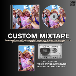
In the heyday of mixtape culture, especially during the ‘80s and ‘90s, J-cards transformed homemade tapes into personalized gifts, artifacts of friendship, and underground promotional tools. Today, creating a custom J-card is a way to elevate your cassette, turning it into a collectible object or a heartfelt present.
The Power of Design: Why the J-Card Matters
A well-designed J-card does more than convey information. It adds visual emotion to the music inside. It sets the tone, evokes nostalgia, and turns a mixtape into a multi-sensory experience. Like an album cover, it’s the listener’s first impression of what’s to come. Whether it’s sleek minimalism, chaotic cut-and-paste collage, or vintage aesthetic, the J-card is your visual voice.
Emotional Resonance
Mixtapes are often deeply personal gifts. A thoughtful J-card design communicates your intention—whether romantic, motivational, celebratory, or mournful. The imagery, colors, and typography you choose can make the receiver feel something before they even hit play.
Branding for Independent Artists
For indie musicians and tape labels, the J-card serves as prime real estate for branding. From band logos to tour dates and social media handles, a beautifully designed insert conveys professionalism and artistic identity, engaging fans even before they hear the first note.
Essential Elements of a J-Card
While there’s no strict template—freedom is part of the magic—most J-cards include these key sections:
- Front Panel: The visual centerpiece with the title, band or mixtape name, and artwork.
- Spine: Displays the name and volume number, visible when the tape is filed on a shelf.
- Inside Flap: Contains liner notes, tracklist, or personal messages.
- Back Panel: Additional art or detailed track information (e.g., length, date, sources).
Optional additions include fold-out lyrics, artist bios, dedications, and even QR codes for digital download.
Design Tips: How to Make Your J-Card Shine
Start with the Right Template
Begin by downloading a standard cassette J-card template with appropriate dimensions (usually 10.25″ x 4.25″ before folding). This ensures your design fits the case snugly and folds along the correct lines. Templates are available for both single and double-sided printing.
Create a Visual Theme
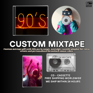
Consistency is key. Select a color palette, font family, and imagery style that aligns with the mixtape’s theme. A synthwave collection might benefit from neon gradients and bold retro fonts, while a lo-fi playlist calls for earth tones and handwritten script.
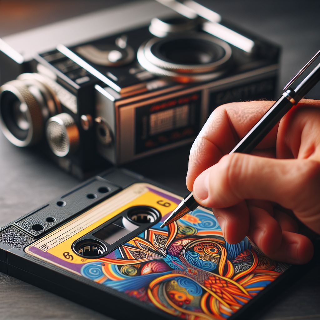
Incorporate Mixed Media
One charming aspect of J-card design is its handcrafted feel. Consider collaging magazine clippings, using original photography, or even scanning hand-drawn doodles. Digitally merge analog textures for a nostalgic-yet-professional look.
Don’t Forget the Tracklist!
Include the song titles and artists, and consider adding timestamps, short descriptions, or why each song matters. The tracklist is both a guide and a memory lane—it shouldn’t be overlooked.
Print with Care
Use high-quality matte or satin paper and a good printer to bring your design to life. A poorly printed J-card can dull your brilliant design. Consider thicker paper stock if you want the insert to feel more premium or long-lasting.
Inspiration from the Past and Present
To gain visual inspiration, look to different eras of J-card designs. The punk DIY aesthetic of the 1980s features gritty black-and-white cutouts and typewriter fonts. In contrast, ’90s R&B mixtapes embraced color gradients, silhouettes, and brush fonts. Modern cassette labels often blend these nostalgic motifs with digital design tools for a fresh yet familiar style.
J-Cards in the Digital Age
Even though streaming dominates today’s music experience, the resurrection of cassettes has given J-cards a new life. They’re now part of Bandcamp merch drops, limited edition releases, and handmade gifts. Digital tools like Photoshop and Canva allow anyone to craft custom inserts, merging analog emotion with modern precision.
There are even apps that help you order pre-scored paper and die-cut cases so your home project looks like a factory release. Whether you’re an aspiring bedroom producer or a nostalgic music lover creating a birthday gift, J-card design offers the perfect canvas for musical expression.
Conclusion
The art of the J-card remains an enduring pillar in cassette culture, embodying creativity, emotion, and personal connection. In a world swamped with disposable playlists, a beautifully designed J-card encapsulates intentionality—a fixed, physical snapshot curated with love. Whether you’re crafting a romantic mixtape or launching an indie album, the J-card is far more than packaging; it’s the soul of your cassette. So fire up those design tools, dig into your sticker drawer, and revive the timeless magic of cassette inserts, one fold at a time.
Ready to bring your music to life?